THE POETRY FOUNDATION IS UNIQUE IN ITS KIND: NOWHERE ELSE DOES THERE EXIST A PHYSICAL HOME SOLELY FOR POETRY. HOW DO YOU CREATE A HOME FOR SOMETHING SO ABSTRACT?
WORDS + INTERVIEW: Caroline Joan Peixoto | IMAGES: James Florio
John Ronan, of Chicago based John Ronan Architects did not shy away from the challenge, but instead overcame it with a calming oasis in the River North area. We talked to John Ronan to hear how exactly one creates a space for poetry.
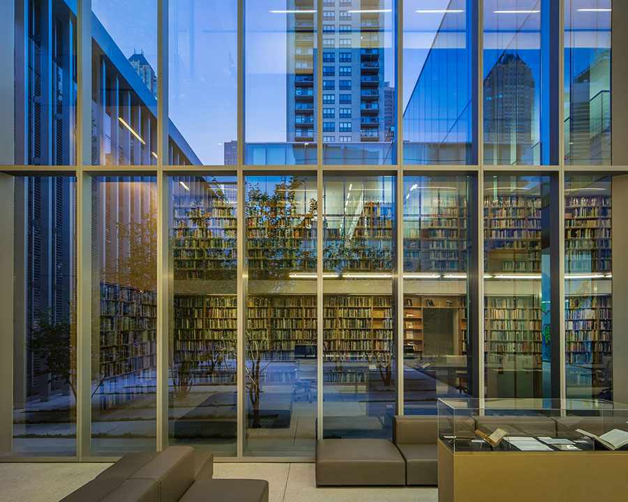
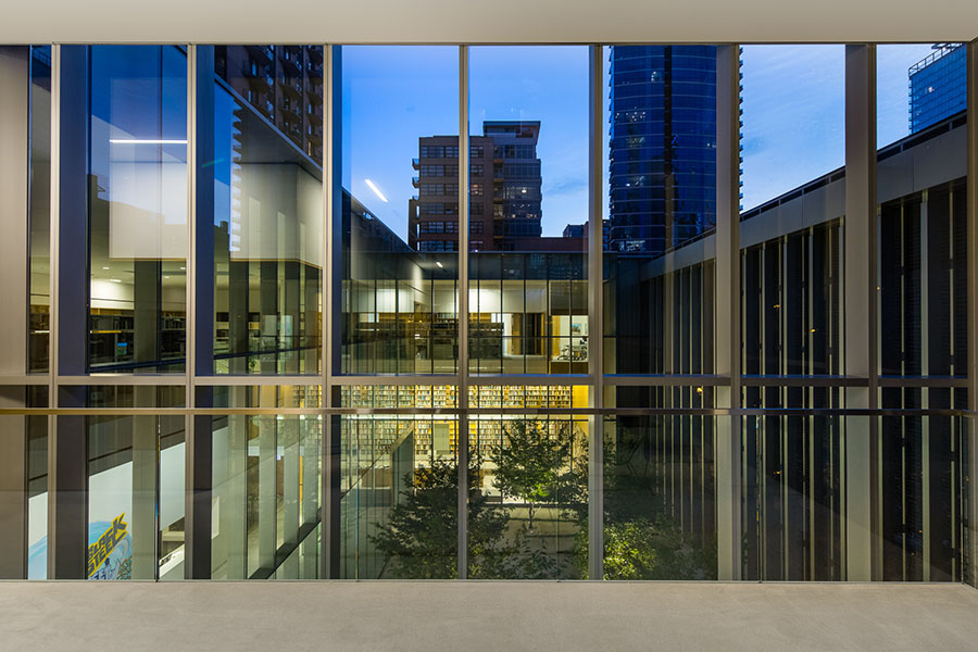
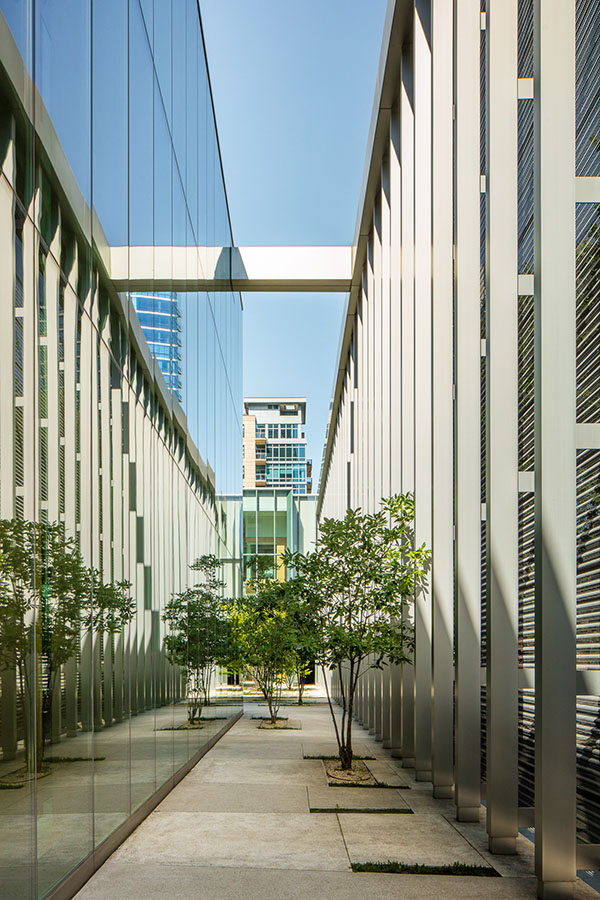
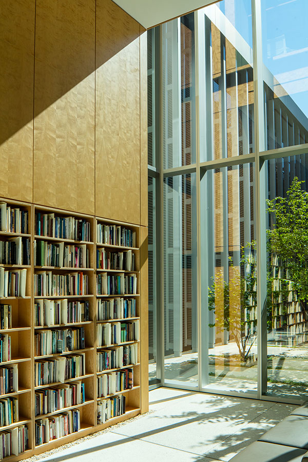
Looking at the building from a certain angle, and being inside the building gives the impression of something unfolding, revealing inner layers. Where did this inspiration come from?
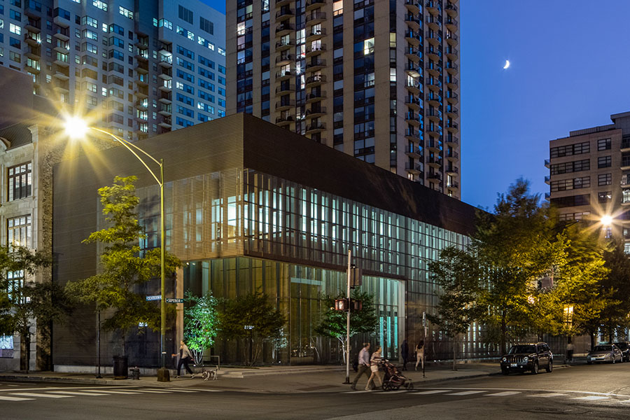
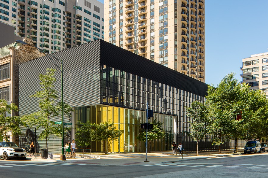
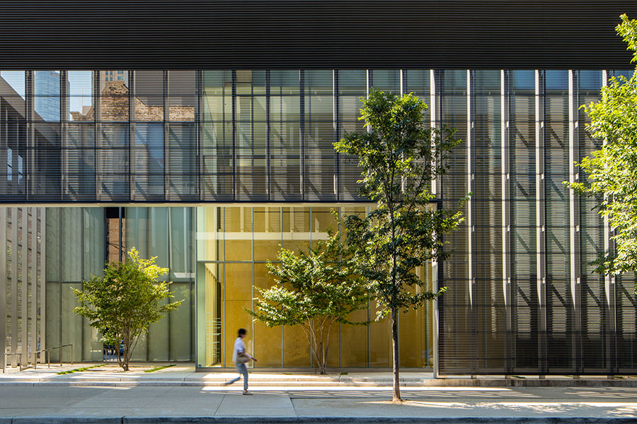
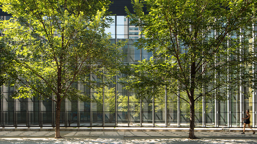
JR: I wanted the building to have this unfolding quality, to be like a poem which unfolds line by line, rather than given away all at once, and to create something that people would want to return to, like a good poem, and find something new in each time. The building design is meant to draw you in, seduce you, rather than to shock or surprise like so much of contemporary architecture. It was designed not to be noticed, but to be remembered.
 What was the collaboration process like between your team and the Poetry Foundation’s staff?
JR: It’s always a pleasure to work with arts agencies, but it was a special experience to work with poets because of their appetite for risk. The foundation was unusually respectful of the design process and they were willing to move outside of their comfort zone. As an example, their advisorsPoe were telling them not to build the oxidized zinc screenwall on the street–it would be expensive and look like a parking garage, and so on. The foundation decided to proceed, anyway, which a lot of clients wouldn’t do. This willingness to take risks separates the great clients from the average clients.
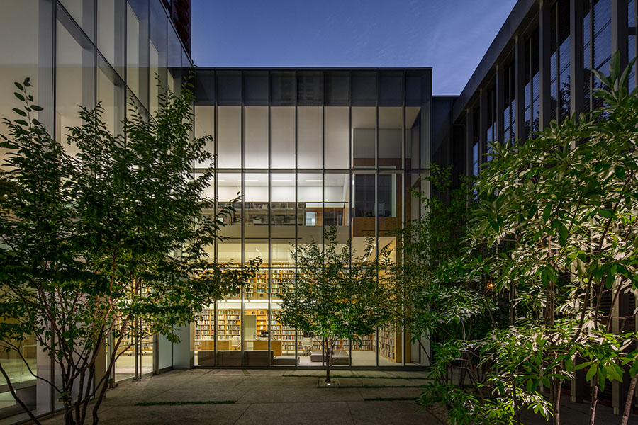
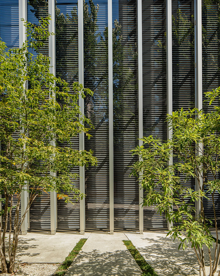
Can you tell us a bit about the technical process, its challenges, and the motivation for the oxidized zinc exterior?
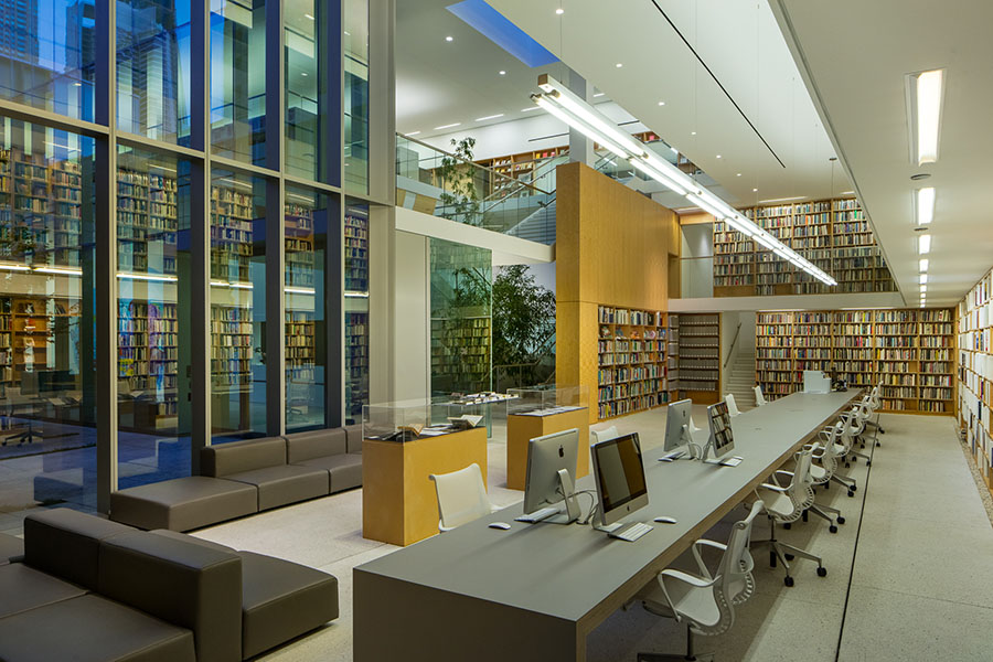
JR: The oxidized zinc was to give the building an elegant, mysterious appearance that I felt was appropriate for a building devoted to the art of poetry. Using corrugated metal, a so
mewhat ordinary material, and then turning it black through this oxidation process results in something unfamiliar and strange, akin to what a poet does with words. The black color connotes authority–like a black belt in karate or the vestments of a priest or judge–and Poetry magazine is basically the authority on poetry in the English language.
How does the city of Chicago inspire your design?
JR: I see my work as part of the lineage of Chicago architecture that has preceded it. Chicago has always been this kind of hard-working place where people know how to make things, and there is a hard-core pragmatism which permeates the culture here which I think you can see reflected in its architecture. If you look at the architects who have succeeded here, from the early Chicago School architects through Mies van der Rohe to the present day, they were architects who could channel this pragmatism but at the same time transcend it, make something poetic out of it. Viewing the Poetry Foundation through this lens, it is a building which is, on one level, very practical but seeks to transcend this condition. So this is what Chicago inspires me to do, and occasionally I succeed.