A CANDID Q&A WITH THE MINDS BEHIND THE NEW EXPANSION OF A CHERRY CREEK MAINSTAY
WORDS: Charlie Keaton | IMAGES: James Florio
When Room & Board arrived in Colorado in 1991, the family-owned home furniture brand settled in the still developing neighborhood of Cherry Creek North. Working with Roth Sheppard Architects, the company transformed a bland warehouse into a chic, thoroughly modern shopping destination. Their furnishings and accessories reflected design movements ranging from Shaker and Bauhaus to Scandinavian and midcentury modern, and Denver responded accordingly.
As Room & Board continued to expand and evolve during the years that followed, so, too, did Cherry Creek. While the neighborhood added new high-end boutiques, galleries, restaurants, and housing, the Minneapolis-based company grew to include 14 stores nationally, with nearly 900 employees and $400 million in annual revenue. The Cherry Creek location had held up well, but it was time to update and expand on the original vision.
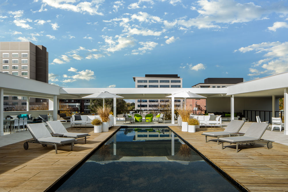
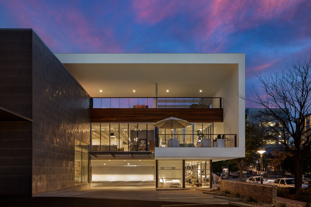
With an eye toward renovation and expansion, Room & Board once again teamed up with Roth Sheppard. The project, completed earlier this year, now boasts a 6,000-square-foot rooftop patio that includes a 60-by-12-foot reflecting pool; 125 lineal feet of street-front display windows; a new second-level showroom featuring two balconies overlooking Cherry Creek; 15,000 square feet of remodeled showroom space; and 50 on-site parking spaces. The store now hosts public, private, and charitable events (including a sold-out panel discussion during Denver Design Week).
We tracked down John Gabbert, Founder and CEO of Room & Board, and Jeff Sheppard, Founder and Principal at Roth Sheppard, to discuss the project in detail. Read on to learn about their design strategies, collaboration, and how to maintain continuity while keeping pace with the city’s changing landscape.
Tell us about the genesis of the partnership between Room & Board and Roth Sheppard.
Jeff Sheppard: Well, it seems like we were meant to work together. Our firm was doing retail and restaurant projects in Cherry Creek at the time, and after meeting John it was clear we had a lot in common regarding our aesthetic tastes, our expectations for architecture, and our understanding of the roots of modern architecture. When I visited John’s headquarters and home in Minneapolis, I recognized a passion and commitment to his staff, a commitment to the craft of furniture making, and a commitment to architecture and design in general. It’s the same passion we have at Roth Sheppard, and that’s really how the relationship started.
John Gabbert: The partnership seemed right from the beginning because we had a similar design process. Jeff and his team are eager to fully understand the design and functional objectives and take the time to explore all the alternatives.

John Gabbert, Founder and CEO of Room & Board.

Jeff Sheppard, Founder and Principal at Roth Sheppard.
Sheppard: John is a hands-on guy. We have a commonality in that we both sketch, and we both understand the importance of designing buildings and spaces so they embrace people while also embracing the site itself. He has a great sense of scale and he understands the processional/sequential experience, so working together is really a melding of our values, our experiences, and our respect for each other.
What has been interesting over the years is the ability John has to work with individuals within my office. I’m a big picture guy, setting the overall goals and design direction for the project, but I also can’t stand it when the details don’t support the big idea. John is the same way, so he’s very collaborative and interactive through the process.
Gabbert: Jeff has a great team of people. For this project, Natalie Brown led the process and was amazing both in terms of refining the design to meet our original, very complex objectives, and ensuring the details of the old and new structure were consistent.
Describe the design vision for the new addition and how it relates to the objectives of the original building. What do they have in common? How are they different?
Gabbert: Our vision and objectives were nearly identical to those of the original 1991 remodel. We wanted to reflect the modern crafted sensibility of our furniture while creating an interior that felt residential, making it easier for customers to make decisions.
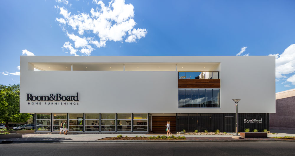
In fact, most of that original remodel has not been changed. The differences you see reflect a larger building, additional parking, and street-facing displays to invite you in. The white stucco of the addition also replaced stone on the existing building. There’s a more modern sensibility that reflects an evolving Denver.
Sheppard: The original building remodel in 1991 has always been one of my favorite buildings. At that time, the building was basically a concrete warehouse with very few windows and definitely no street appeal. It was a bit of an eyesore in Cherry Creek and it was one of the few buildings that had grade-level street front parking.
Our objective at that time was to bring in daylight, create a transparency to the street, and to figure out how we could leverage the parking as a positive versus a negative feature. We also wanted to see if it was possible to remodel the exterior of the building such that it embraced and respected the regional context in Colorado.
We were interested in uncovering the true drivers of regionally inspired contextual architecture, so we focused on climatic and cultural ideas versus stylistic trends. This led us to recognize the significance of light, shade, shadow, transparency, and the juxtaposition of raw and natural materials to more contemporary finishes and materials. It is this idea of juxtapositions that really informed the design of our original remodel: new versus old, solid versus transparent, mountains versus plains, high tech versus agrarian, inside versus outside, and so on.
We even figured out a way to engage and define the entry procession from the car to the front door and into the building, so it became a delightful experience. The idea we came up with was to think of the parking lot more like a plaza (we even deleted the parking lot lines and inserted a paved area in the middle of the lot).
We extended cantilevered steel framed elements off the building to act as carport coverings, planted an aspen grove to mediate the scale shift between the parking and the building, and created a more human-scaled and enjoyable entry sequence for the building. This way the customers’ expectation level was enhanced prior to their arrival to the front door.
At the interior of the remodel to the original building, we worked with John to design an intentional and sequential arrangement of rooms and open spaces. This allowed customers to get a better sense of furniture displayed within a scaled setting that was more indicative of how you flow through rooms in a house, versus seeing a bunch of furniture in a warehouse setting.
Overall, the building and interiors had this sense of scale more in line with residential-scaled architecture versus a commercial showroom. Yet at the same time the exterior design moves: The glass walls, the exposed steel structure, the wood poles supporting the entry canopy, and the textural juxtaposition of stone cladding against concrete were all done to create a subtle connection back to regionally appropriate architecture.
Many of those same ideas are evident in the new addition and remodel. There are intentional juxtapositions: heavy and light, solid and void, natural (wood siding) and manmade (stucco), that speak to the original intent. Yet there are differences, as well. While the previous remodel is ‘grounded,’ the addition is lifted off the ground and edged around its perimeter with narrow-depth, glass-enclosed furniture display rooms that screen the parking beyond.
The addition is brought out to the street corner at 2nd and Detroit to activate the street while at the same time stepping back to frame the edge of the original parking plaza. In a sense you feel like you are driving right into a furniture showcase. The existing building and the new are now all white, co-joined by the zinc clad volume of our original remodel. Together the new building and our previous remodel read like a large scale modernist villa, with expanses of glass and solid wall apportioned based on visual acuity, solar exposure, and a desire to mediate the scale of the surrounding larger volume developments.
The intentional juxtaposition of a simple white box against the overly articulated and eclectic surrounding buildings gives Room & Board its presence and resonance while communicating its brand.
From an interior standpoint, we used the connector space between the new and the previous remodel as a place to insert a new four-story stair that connects the basement level to the rooftop deck. The open stair volume is daylight from above and acts as a vertical shaft of light drawing customers up through the building, culminating in the meditative roof deck. The roof deck functions as outdoor furniture display while also giving customers the opportunity for visual and physical respite.
How have demographics and design trends evolved since Room & Board first arrived in Denver, and how has that affected both interior and exterior design strategies related to the new addition?
Gabbert: Denver has seen significant change in the last 16 years. As with much of the country, a more modern, functional, simple, and real way of living is desired by many. That has always been the focus of the furniture we create, and we wanted the interior and exterior design of the addition to communicate who we are.
Sheppard: The most difficult thing to do is to design something simple — something that outwardly appears simple but can unfold to expose its layers of meaning. Simple but not boring. Pragmatic yet artistic. Refined without feeling formal. Responsible but still free. These are cultural ideals alluding to how we see ourselves that have been interpreted architecturally.
Physically, our building improves the street by making the existing building now feel complete, by refining the entry plaza, and by mediating the scale between the larger developments around the site and the residential neighborhood to the north.
As Cherry Creek has evolved from a smaller-scaled commercial and residential-scaled neighborhood to a denser urban condition, our original remodel was being consumed by the scale of the surrounding developments. The new addition and remodel now gives a greater presence to the store while creating more useable and activated public space. Supplementing this visual presence is the intentional simplicity of a refined and elegant modernist box that provides a welcome visual relief from the needless complexity of many of the newer projects in Cherry Creek.
Rather than respond to changing fashion and design trends, the exterior and interior design the original remodel and the new addition represent timeless concepts. These include designing interiors so they respect human scale and behavioral patterns; designing interiors that are enlivened by natural light; and most importantly, recognizing that people love to watch other people as they shop and explore. In a time when social interaction is becoming more and more exclusive and self indulgent, this building provides an opportunity to stimulate social engagement between people, as well as a physical engagement between people and product.
Yet we also know that the pragmatics of lifestyle downsizing are evident in our culture today. We have interpreted this not just through the physical presentation of furniture, but through the manifestation of ideals that suggest an economy of means — a simple, uncluttered lifestyle and an escape from the needless complexity of everyday life. All these ideals have influenced the design of the building and its interiors, giving the building its minimalist elegance.


