NESTLED QUIETLY IN THE BOULDER FOOTHILLS, A LITTLE-KNOWN CADRE OF CREATIVE DESIGN FIRMS IS WORKING TO UPEND THE WAY AMERICA APPROACHES ITS DIETARY NEEDS. THEIR LEADER IS A MAN FAMOUS FOR SELLING EVERYTHING FROM HAMBURGERS TO VOLKSWAGENS. BUT THESE DAYS, HE’S GOT A VERY DIFFERENT PRODUCT ON HIS MIND.
WORDS: ROB BOWMAN + CHARLIE KEATON | IMAGES: TREVOR BROWN JR.
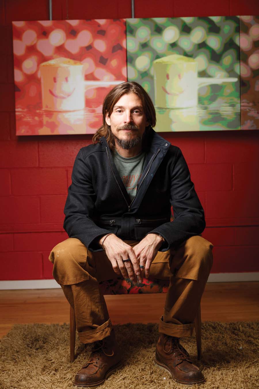
Alex Bogusky is worried about you. He’s concerned that you’re not eating your vegetables and that this basic oversight is undermining your life in ways you don’t even realize.
If this sounds like behavior more befitting your mother than the man Adweek magazine once named Creative Director of the Decade, well, take a minute to appreciate the bigger picture. This is a tapestry woven from simple issues like health, friendship, and charity, but also extraordinarily complex issues like product design, video production, entrepreneurial innovation, web development, sales paradigms, and, at its heart, an unlikely team of collaborators working to address universal problems on a deliberately local scale.
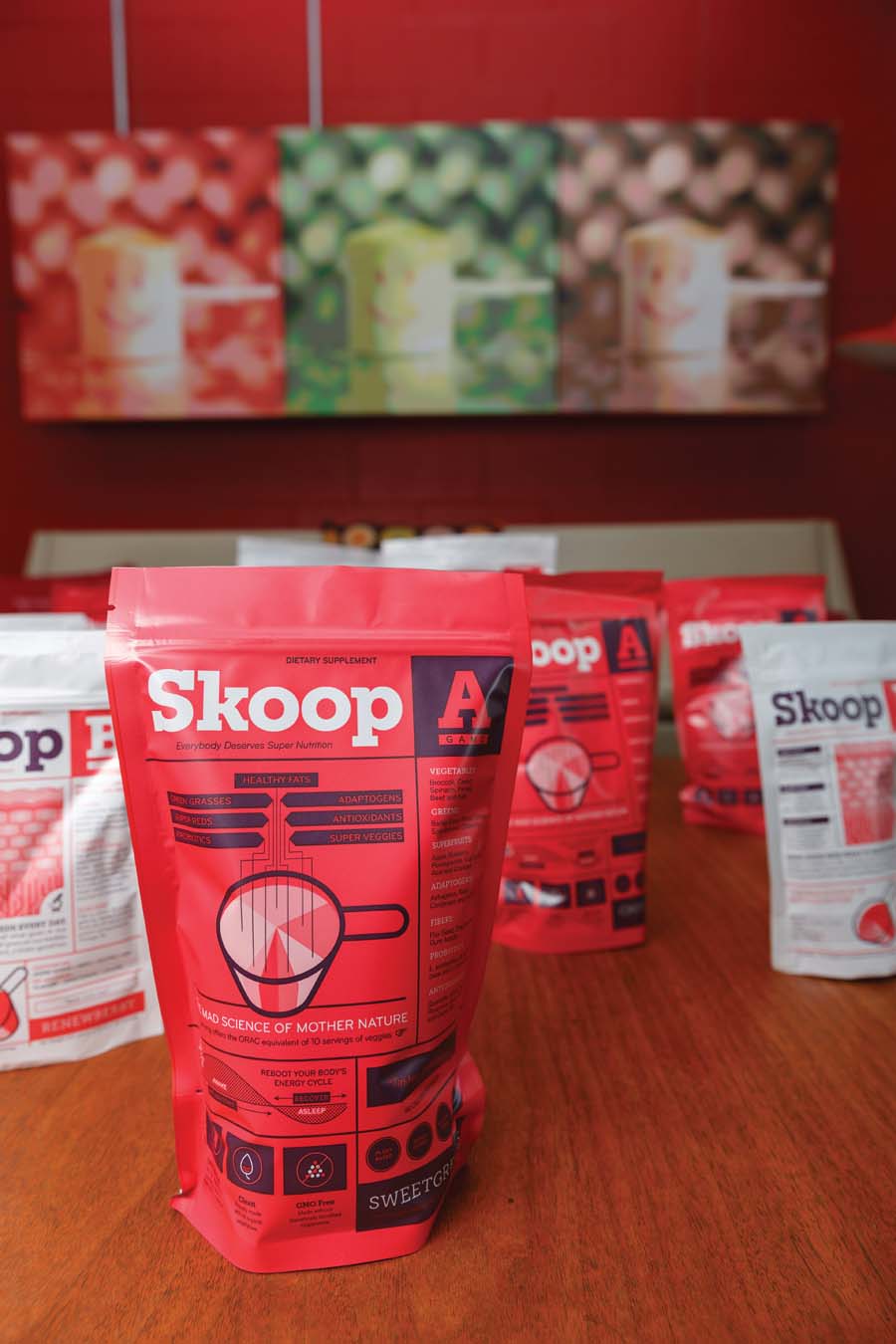
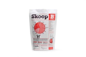
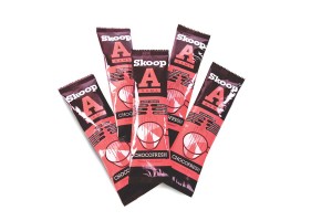
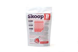
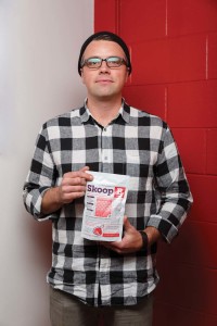
The product inside this quirky little bag is called Skoop. You probably haven’t heard of it yet, but its growing success has serious implications for the business sector, the social sector, and public health in general. And none of this would have happened if you had listened to your mother and eaten all your vegetables. “We wanted to do something in food, but we didn’t want it to be something like a ‘better for you’ product, like a better-for-you cracker or a better-for-you chip. Those things get traction, but they don’t really address the issue.”
That’s Alex Bogusky talking. For most of the past 20 years, he was creative director, partner, and eventually co-chairman at Crispin Porter + Bogusky, an industry behemoth with an international footprint and annual billings north of $1 billion. The issue that he’s talking about now—the issue that drew him from the advertising mountaintop to a literal mountaintop in his adopted home of Boulder—is nutrition. Or perhaps more accurately, a pervasive lack of nutrition.
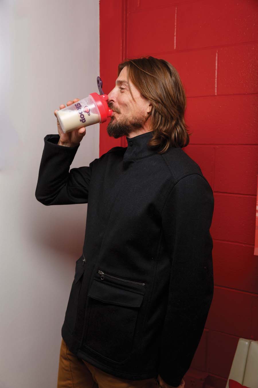
Since leaving CP+B, Bogusky teamed with Izze Beverage co-founder Greg Stroh and celebrity doctor James Rouse to launch a series of products meant to address this collective malnutrition. At its most fundamental, Skoop is a line of powdered, plant-based dietary supplements that can be stirred into a beverage or whirled into a shake. Designed by Rouse, these products contain no synthetics and no genetically modified organisms. Their primary ingredients are organic fruits and vegetables, herbs, fibers, honey, and stevia extract. “We wanted to get closer to the issue, and for us the issue was that people don’t eat vegetables,” said Bogusky. “If you don’t eat vegetables, you don’t get phytonutrients. If you don’t have phytonutrients, you don’t feel good.”
But getting the recipe right was only the first step. Transcending the niche markets traditionally associated with supplements—bodybuilders and hippies, if you’re okay with broad generalizations—meant making Skoop not just healthy, but accessible and approachable.
So how do you reach not just the athletes or the health nuts, but the athletes and the health nuts and all of their friends, co-workers, and grandparents? The answer to that question starts with an unusually transparent approach to design.
The Skoop braintrust made a bold decision early in the process. Bogusky sums it like this: “Take the back of the package and put it on the front.”
The pseudoscientific jargon that clutters up most supplement packaging? Gone. Slick, market-tested logo? Nope, not really. Friendly, anthropomorphic product mascot? Certainly not. Pick up a bag of any Skoop product and the first thing you’ll notice is that all the ingredients normally relegated to tiny print on the back are front and center. Information is the hook, and rather than bury that information or dress it up to look like something else, it’s presented with pride.
But transparency presents another problem. How do you make all this information visually appealing? Can wonky nutritional data be sexy?
To solve that problem, Bogusky and company turned to Good Apples, the Boulder-based design firm best known for its work with Sticker Giant and Matter Cycles. The Good Apples team came up with a packaging look that is clean and inviting while still delivering loads of information. What could have been a constraint—the total lack of jargon, slogans, and mascots—turned into a strength as it yielded a fresh look that contrasts favorably against the industry’s status quo. The real masterstroke, however, was the development of a series of playful charts and infographics that take potentially overwhelming wellness terminology and make them not only accessible, but a little bit fun, too.
As Good Apples co-founder Justin Fuller said, “The amount of information contained on the front and back of the packages was intentionally over-the-top. But feedback from customers has been that they really enjoy interacting with the package and learning more about the product over time.”
Skoop now had a well-defined look worthy of its growing product line. These packages are eye-catching enough to stand out on any store shelf—except they aren’t destined for store shelves at all. Which only introduces another issue of enormous importance.
Twenty-first century commerce requires businesses to have a strong web presence, if for no other reason than the credibility that it provides. Ever get wind of a new product, only to visit the company website and find it outdated, convoluted, or just plain unprofessional? That is the ethereal realm where potential purchases go to die.
This is doubly true for startups, who don’t have the luxury of relying on legacy customers or brand familiarity. And for a business like Skoop, which relies on social selling and web sales in lieu of traditional retail store placement, a robust, cohesive web presence—starting with an official website, but also including social media and video—was absolutely critical. Bogusky, Stroh, and Rouse needed a site that could provide lots of detailed product information, facilitate (and even encourage) painless shopping, provide a user-friendly platform for their growing army of independent Skoop Sellers, communicate the company’s charitable opportunities, and handle some complicated back-end fulfillment logistics—all while maintaining the same casual, whimsical voice that Good Apples brought to the packaging.
To accomplish this, Bogusky once again tapped into the Boulder creative community by hiring Human Design, a fast-rising firm founded by John Weiss and Matt Null. He also drafted local video production outfit The Lot, and brought in longtime colleague Mike Howard from Boston to write a very specific, highly nuanced brand of conversational copy. On the web design side of things, Weiss and Null brought nearly 25 years of agency experience, but this project felt special from the outset.
“One of the things we focus on as an agency is how do we make every touchpoint as human, and as accessible, as possible,” said Null. “The key is information architecture and placement. The great thing about the design of this site is that we let the imagery and the information do all the work. Essentially, that is the design.” Added Weiss, “We just took their story, which is beautiful, got out of the way, and let the product speak for itself.”
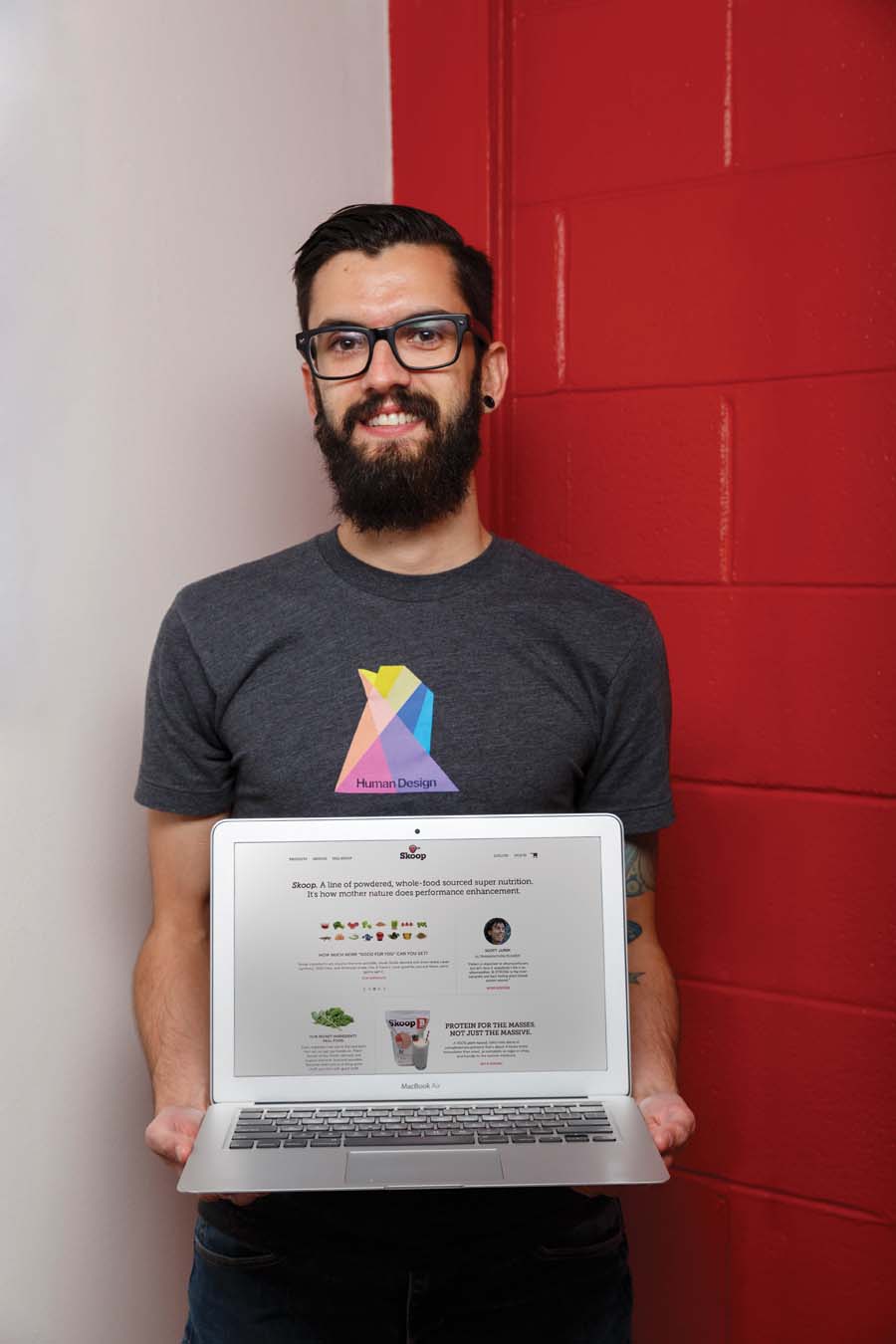
It is a nice sentiment, though perhaps overly modest. Constructing a website that’s easy to navigate and filled with snaking pathways that reveal vast amounts of nutritional information takes a light touch. Marrying that with the technical requirements inherent in hosting an online store, plus countless other virtual storefronts for those customers now empowered to sell Skoop to their friends and acquaintances, is no picnic, either. Somewhat improbably, the team at Human Design did all of this and more in a scant three months. The Skoop website is indeed welcoming, informative, and easy to navigate. The videos produced by The Lot are funny, engaging, and memorable. And Mike Howard’s copy takes all of it—the huge reams of data, the obscure nutritional information, the infographics, and the page-by-page web content—and ties it together.
It wasn’t long ago that Alex Bogusky was devising clever ways to sell millions of fast-food hamburgers. He doesn’t anymore, and while he may have lost the taste for that particular brand of advertising, his enthusiasm for storytelling—for taking a product and distilling it to its essence in order to make it presentable to the world at large—hasn’t diminished. “The style is what comes organically to me,” he said. “We want it to be accessible and charming. We want it to be natural. We don’t want to preach to people. We don’t like being preached to, and I think that so much of what has been done in this space has been done the wrong way.”
In many ways, Skoop is the fullest realization yet of Bogusky’s approach. He helped launch a line of products that promote health and wellness. He helped design packaging that will make those products accessible to the masses, transcending industry barriers that have been around for decades. He helped construct a website that connects his products with people, and he helped people engage with those products by producing videos which make better health seem not only relevant, but attainable.
But the credit doesn’t belong to Bogusky alone, because innovative design does not happen in a vacuum. True innovation is the product of inspired collaboration between passionate, like-minded teams of people doing hard work over long periods of time.
Alex Bogusky has some very creative friends in Boulder. Right now they’re probably huddled around a conference table, hashing out ways to improve Skoop’s formula, design reusable packaging, streamline web functionality, or storyboard new videos. The Boulder design community that orbits and supports this largely unknown startup is on a mission, and that mission involves nothing less than using great design to make better health available to anyone who wants it.
FOR MORE ON SKOOP, CHECK OUT OUR SERIES:
Part 1: Well(ness) Designed
Part 2: Getting the Words Right
Part 3: Saving the Health of our Youth


