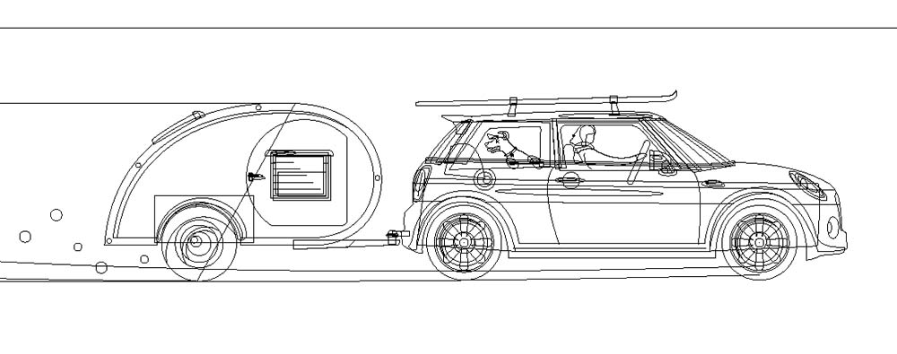
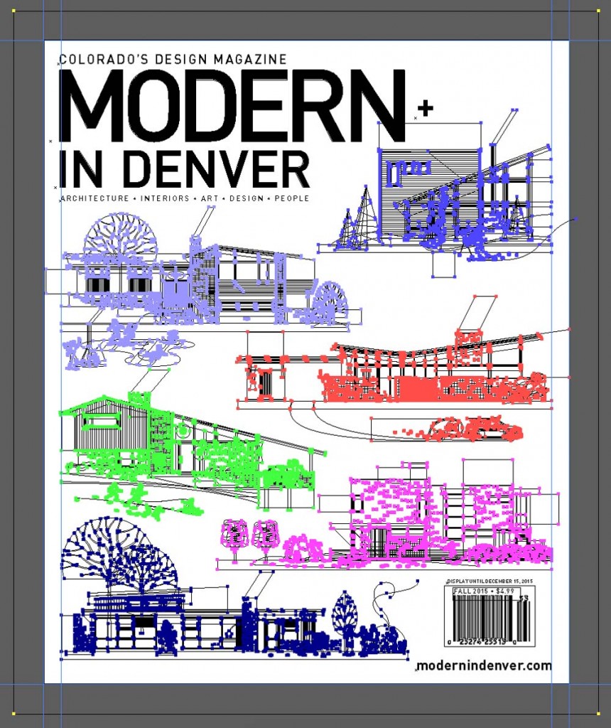
What we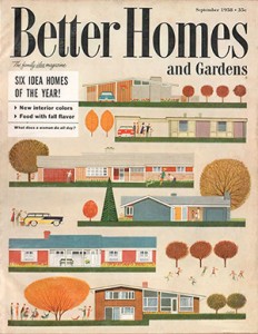 nt into the illustration of our winter cover? One designer, 40+ hours, 7,703 paths, and 35,344 points in Adobe Illustrator to be exact.
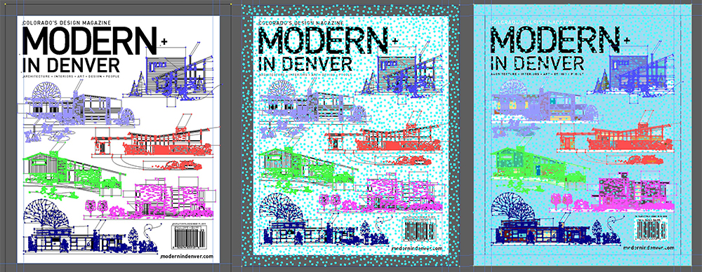
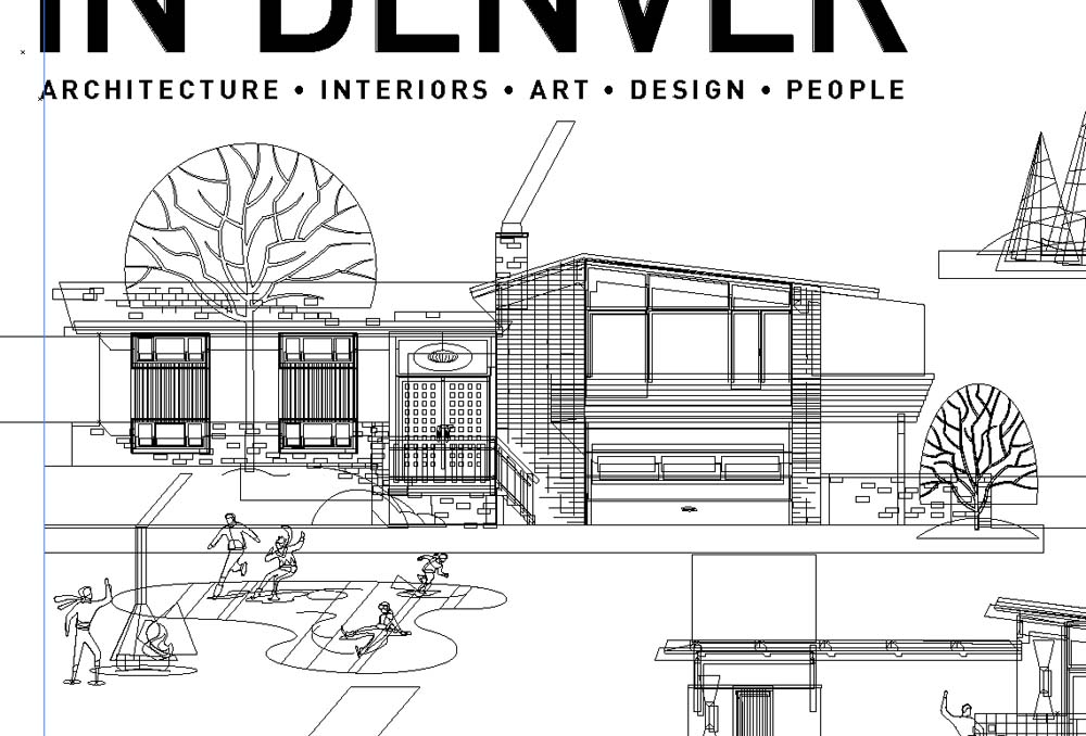
The cover, inspired by the September 1959s issue of Better Homes and Gardens, captures the essence and look of the vintage cover, but became current with Christian Musselman’s detail, including modern homes and vignettes.
We wanted to learn more about the intricacies of the illustration, so we caught up with Musselman. Read on to gain insight into the painstaking process of illustrating architecture.
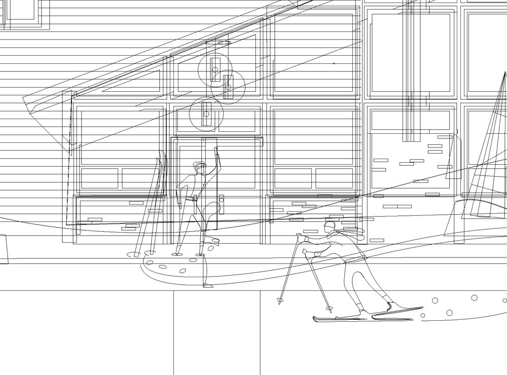
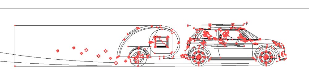
Many times, I will start with a traditional pencil sketch, but for this illustration, because it is so linear and one dimensional and the concept was being defined by the Better Homes and Gardens cover, it felt better to start with digital rough—just to start the process of jigsawing and piecing the elements together, making sure things fit nicely together in terms of style, size, color, and location on the page. I do traditional sketches, then scan them in, and redraw them in the computer. It preserves the organic feel when I’m doing them on paper and pencil.
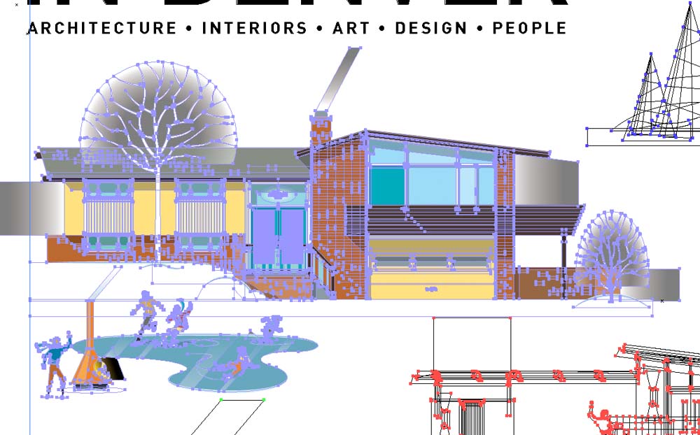
Illustration work like this is as much about the “design” as the illustration work. Each of the houses had to be created (built!). One home (the dark brick one) is featured in the magazine, but the others are mostly made-up in my mind … although inspired by reference that I’ve found. A lot of things have to come together to make the illustration work. For instance, I needed to create a style for the people that worked with the houses and create activities for them, to have them tell a story. It takes a good bit of time playing and experimenting to find what styles and elements work well together.
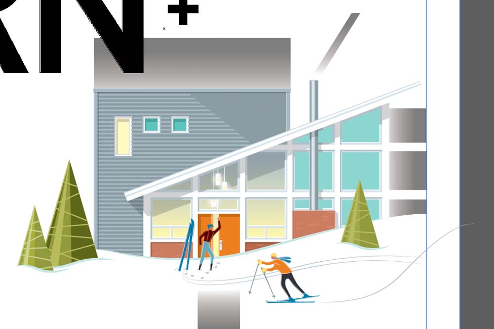
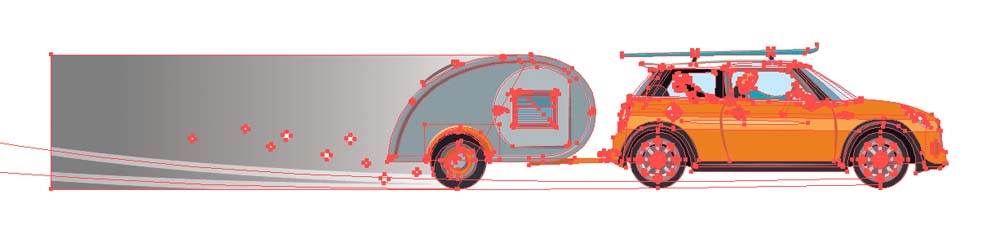
I really enjoyed created a limited color palette so the whole illustration looked cohesive and contemporary, but still had a bit of a retro feel. I like playing with color and creating nice balances in how the key colors are used in the artwork—scattering the darks, lights, accent colors, etc. For instance, the color orange is used throughout the illustration—in some place on or around each house, even if it’s as simple as the berries on one of the bushes or a person’s clothing. I like making sure that in a limited color palette, the colors reappear and are balance throughout the artwork.
The challenges make it an interesting assignment for me. Working to develop a contemporary illustration that felt modern but referenced the Better Homes and Gardens cover was really a great challenge. The original is such an iconic image. My thinking is, “What can I bring to it that makes it feel appropriate to today’s viewer and the magazine’s focus, while still paying homage to the original?” Hopefully I’ve accomplished that.
I’ve always been interested in architecture. It has never been a major part of what I do for my day job, but I’ve always been drawn to it. If I were better at math I would have become an architect! I come back to it, because I have a different appreciation for it at this stage in my life.
Visit Christian Musselman online to view more of his work, including custom home portraits.