Craig Rouse, the man behind the graphic design
By Heather Shoning
Design After Dark is a one-of-a-kind annual event that brings together over a thousand people from the design and arts community to celebrate, raise money and elevate awareness for the Department of Architecture, Design and Graphics at the Denver Art Museum. On January 31st, Design After Dark will celebrate 10 years with the theme CAST. Presenting a different theme each year is a big part of what makes Design After Dark such a unique and special event and creatively capturing the essence of each year’s theme for the invitation and related event materials has fallen on graphic designer Craig Rouse for all ten years. We caught up with Craig to talk about the event, how each theme is decided upon and how he comes up with the visual identity each year.
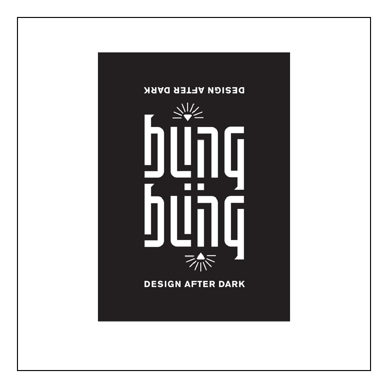
Bling 2005
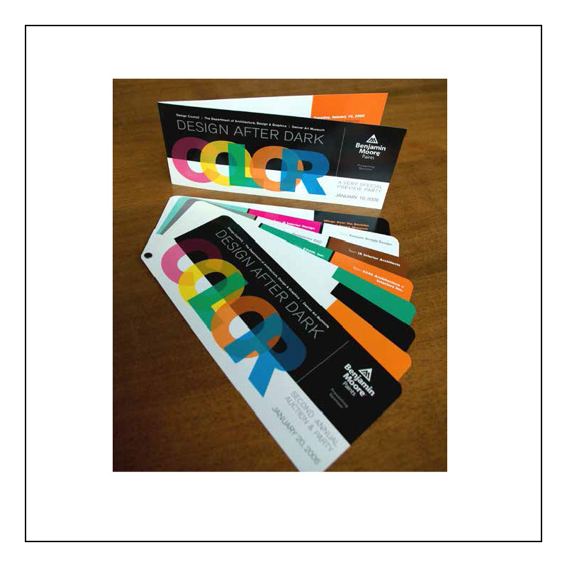
Color 2006
[MID] Describe for us your design business and the types of work you do.
[CR] My business is a graphic design studio. I wear all hats in the studio as the sole proprietor. I create identity and logos for clients and some print design. A larger part of my business is environmental signage design. I’ve done a lot of work with the Denver Art Museum—most recently exhibit graphics for several the touring art exhibitions that come through the museum. I enjoy problem solving and creating unique design solutions for every client. I don’t do cookie-cutter design. Everybody has a unique problem to solve or a unique situation they need a graphic for. I pride myself on coming up with a creative solution for everybody. I really enjoy creating the identity and branding elements for clients or events.
[MID] Why, how long and in what capacities have you been involved with the Denver Art Museum?
[CR] I was asked to join the Design Council just over ten years ago as a board member. I have always been very involved with creating the graphics for the Design Council’s events. In 2005–2006, while an owner/principle at a design firm prior to starting my own business, we designed the interior and exterior signage for the Denver Art Museum’s Hamilton Building.
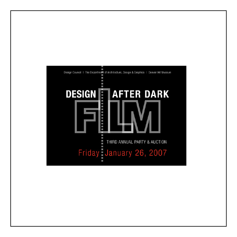
Film 2007
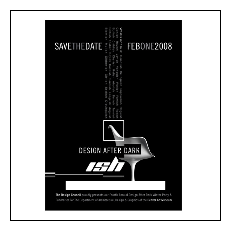
Ish 2008
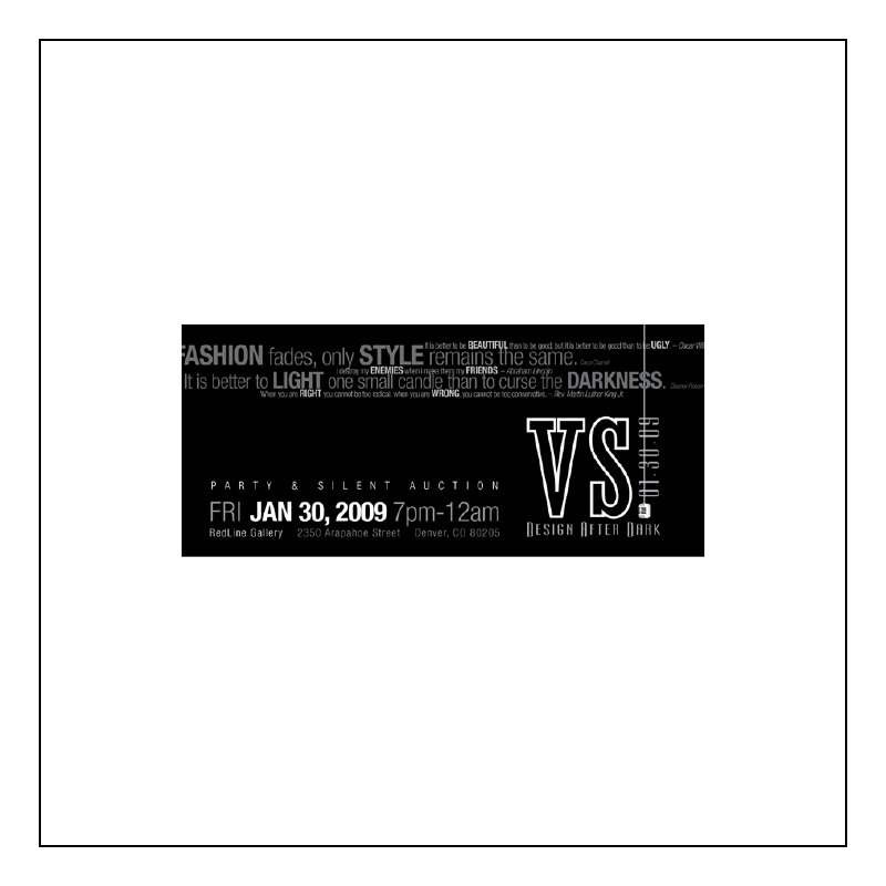
VS. 2009
[MID] How did you get involved with Design After Dark and ultimately end up designing the invitations for all ten years of the event?
[CR] I guess because the first Design After Dark concept was created about the same time as I started with the Design Council. Being a graphic designer, I was one of the obvious choices to design the graphics. It was a lot of fun then and continues to be fun in the 10th year.
[MID] Are you part of the team that chooses theme?
[CR] I am, actually. I’ve been co-chair for event the past three years. I don’t always get to come up with the theme, but after each event we talk about ideas for the next year. We try to select something relevant to what’s going on in the museum. Sometimes the museum influences what we pick, but most often it’s by committee decision.
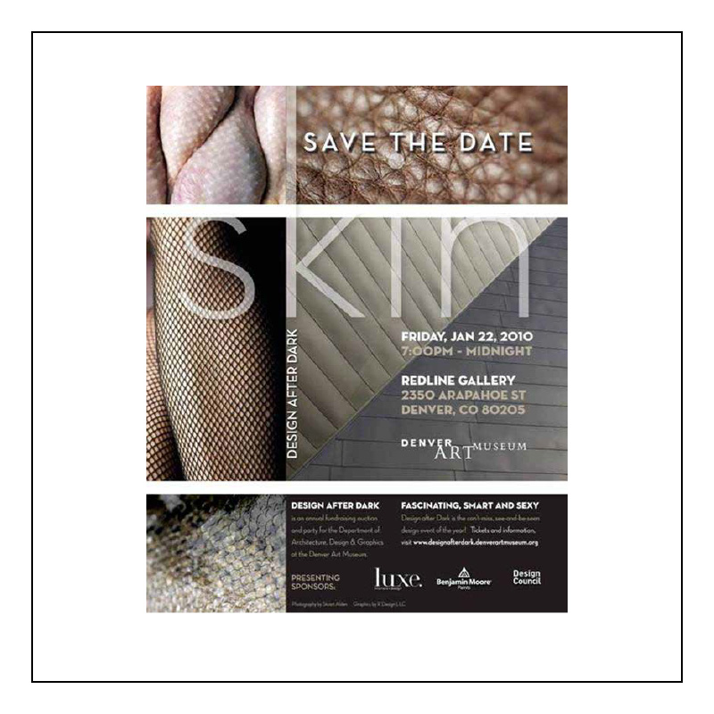
skin 2010
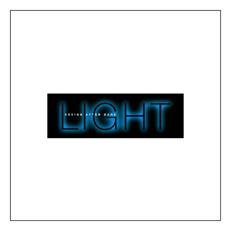
Light 2011
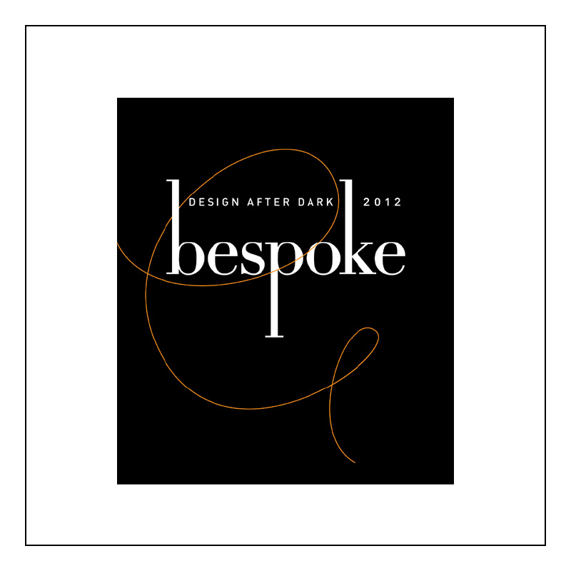
Bespoke 2012
[MID] What’s your process for developing the graphics from the theme?
[CR] For the theme we like to pick a single word: Color or Skin or, as in this year, Cast. We talk about what that word means and how can we graphically interpret it to be meaningful to event and what we’re trying to do for the event. Cirque was not just about the circus, but different acts underneath the tent. I’ll create a table full of ideas in black and white. I often start playing with typography or an image or symbol that represents the theme. For the initial rounds of graphic concepts, we involve just a few people from the committee, myself, Darrin Alfred and Megan Hudacky, then later share it with the larger group. The name of the event, Design After Dark, speaks of darkness and light, so typically we produce the event graphics in black and white.
[MID] Does the invitation design become part of the decoration of the space?
[CR] Sometime it does. For Cirque the graphic was a colorful piece. We ended up streaming wide fabric swathes over the space to create the feeling of being inside the tent. In 2011, Light, the decoration consisted of a lot of projected light both inside and outside the event space. Skin, tall banners hung from 2rd floor that spelled word ‘skin.’ The space allowed for those tall, vertical elements. A lot of things influence what we’re able to do with the space itself. It’s always about the art objects that designers and artists have created to be auctioned off—they are the focal point. The branding and graphics take a supportive role in the evening. They are the frosting on the cake.
[MID] How do you make each year’s invitation unique?
[CR] A lot is determined by budget. For instance, if we have an in-kind donation from local printer, we might be able to do a large folded invitation with multiple colors. However, black and white pieces are cost effective to create. This year’s invitation is a simple flat postcard. Because of the fact that we’ve been doing it for ten years, the design community knows something’s coming. We’ve earmarked late January and early February as “Design After Dark time.” Therefore, we don’t always have to reinvent the wheel. It’s not being sent to a whole new group of people, so it doesn’t need bells and whistles. We can better spend our budgeted money on other things.
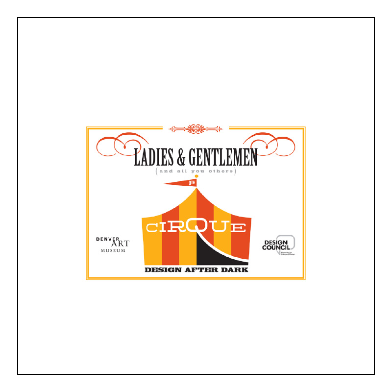
Cirque 2013
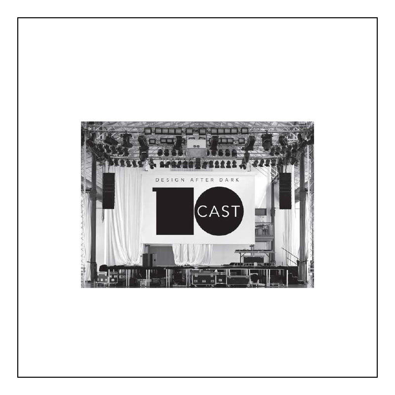
Cast 2014
[MID] Is there one constant element you’ve used in the invitation design throughout the years?
[CR] Not really. I guess maybe doing something with typography. That’s important to me and it shows in the graphics throughout the years. Every design needs to work in black and white—that’s important for any logo, no matter what you’re doing. I’m sure to create something that’s not too trendy, just clean graphics and design.
[MID] What does Design After Dark represent for you?
[CR] It’s interesting how Design After Dark links so many disciplines and professions from interior designers, architects, graphic and industrial designers, collectors and educators—it runs the gamut. Design and art reflect the audience we connect to through this multifaceted design community. It’s really engaging and a joy to be a part of. The museum can reach out and touch the art community through this event and the audience continues to grow, be excited and support the event. It makes me want to be involved with it every year.
[MID] Why is it important?
[CR] It allows the museum’s Department of Architecture, Design and Graphics to reach out and do something outside of museum that is somewhat unexpected. We can bring a community of multiple disciplines together for one night that is so much more than cocktails or objects and bidding. It’s really about creating a space for the design community to come together and have a good time. Many don’t see each other on a regular basis. With 800 people it’s a pretty dynamic thing to do each year. By the way, Design After Dark is just one of many events the Design Council puts on every year. However, it does happen to be the coolest.
[CR] Finally… I have to recognize the committee members, volunteers and great sponsors who make this event possible. The list is so long it’s impossible to name them all here, but each of them is integral to the success of the event. Thank you.
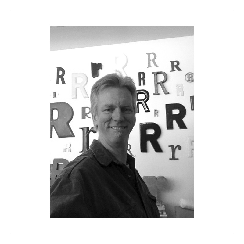
Craig Rouse
Event Details
Friday, January 31, 2014 • 7:00-11:00 pm
McNichols Civic Center Building
144 West Colfax Avenue Denver, CO 80202
Visit for designafterdark.denverartmuseum.org
for tickets and information.
See more of Craig’s work HERE.


